Impact Church (Ontario): Branding
Summary
Impact Church, located in Ontario, Canada, has trusted our team at Dresden with their graphic design work for years now, so we were excited when they came to us about rebranding their organization. Inspired by modern church giants that have a presence online and across state and country lines, they wanted a simple mark that could stand out, be on-trend/youthful, and to reflect their name: Impact.
DESIGN
Sara Reitenbach
Josh Stannard
Josh Feit
SERVICES
Branding
Icon Design
Logo Design
Packaging Design
Print Design


The final logo contains downward pointing arrows as if denoting a specific location, a target point, a place of impact.
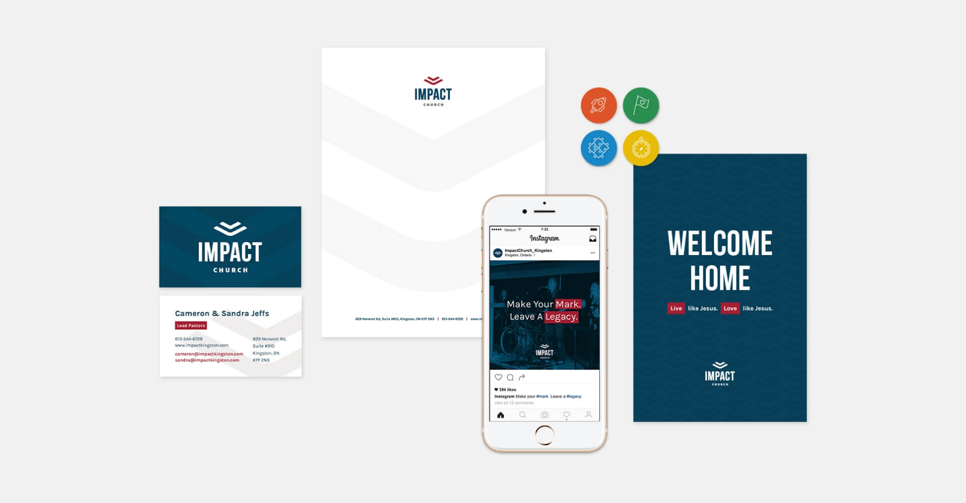
They wanted a bright, energetic accent color and then colors that give a nod to traditional hues to fill out the rest of the color palette and could make a statement across their many promotional pieces throughout the church and community.


Growth Track Icons
In addition to their main logo and brand, Impact Church asked us to create a set of icons with its own set of colors to represent the four areas of growth and involvement that they focus on within the church and local area. These four icons represent launch, mission, freedom, and community, all of which play out in different programs such as receiving counseling, volunteering, overseas missions, community groups, service projects, and more.
By using four unique colors, we created a quick visual reference for readers to know which materials and programs are associated with the specific focus they are looking to get involved in.
Growth Track Icons

Launch

Mission

Freedom

Community