Dominion Imaging: Logo Design
Summary
The branding journey with Dominion Imaging began with a challenge. Radiologic Associates of Fredericksburg, a Top 100 Radiologists group, wanted to open a new imaging office (Dominion Imaging) in the midst of several medical giants in Richmond, Virginia. The brand needed to evoke professionalism, experience, and boldness. The challenge, visually, for us at Dresden was to create a logo mark that fit this criteria and could hold up against those giants, but would bring a modern flavor. The brand needed to reflect the technology and expertise of Dominion Imaging in a bright, fresh, and unique color palette.
DESIGN
Becky Miller
Sara Reitenbach
SERVICES
Branding
Logo Design
Our team developed several different logo concepts for Dominion Imaging’s first brand presentation. The concepts each fell at a different place on the scale between traditional, formal Richmond medicine with contemporary twists to completely abstract modernity. We had logo marks that represented imaging rays, the DI initials, imaging lenses, the dogwood (Virginia's state flower), and pillars with a modern take giving a nod to Virginia being the Old Dominion state.

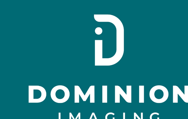
The Logo Mark & Letterforms
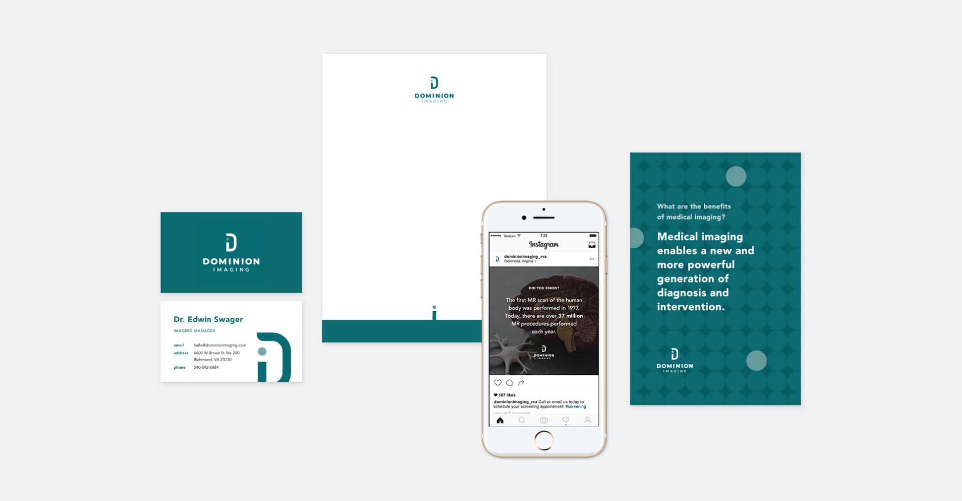
The Dominion Imaging team chose one of the more simplistic but most modern concepts we presented to them. This mark and type work together to bring the weightiness, boldness, and straightforwardness needed for the brand to hold its own in a competitive area. Simultaneously, the sleek, modern curves communicate being at the forefront of cutting-edge technology and practices. The lack of many hard angles in the mark paired with a sans serif font subtly conveys the softness that is needed within an industry that is often associated with life-changing news.
Designed in cooperation with Story Collaborative.