Red Mountain Grace: Branding
Summary
Located near world-class hospitals in Birmingham, Alabama, Red Mountain Grace provides and maintains apartments for out-of-town patients and caregivers. They are the experience of comfort and grace for these families during life’s most challenging moments. When they approached us here at Dresden about designing a new brand for them, we knew we had to provide a brand that visually translates that peaceful mission, welcoming each guest with warmth and individual connection, while also creating a bold look to mirror sturdiness, professionalism, and a strong personality that can endure.
DESIGN
Laura Dreyer
Sara Reitenbach
Josh Feit
SERVICES
Branding
Logo Design
Packaging Design
Print Design
Web Design
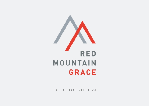
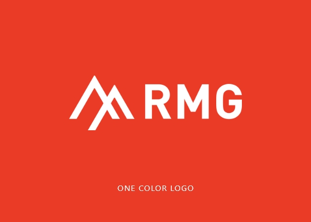
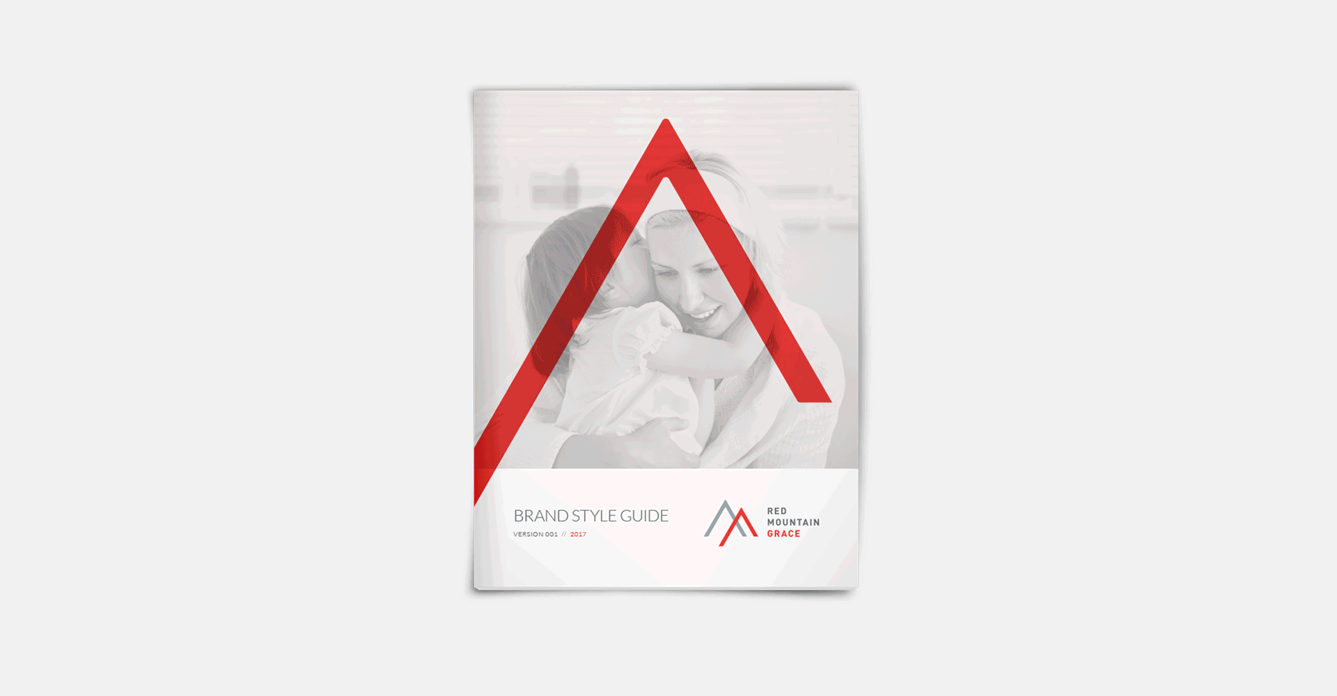
Strong angular forms and a clean, modern wordmark represent mountains, solidarity, vertical movement, and growth.
The Logo Mark
Symbolism in the RMG logo touches on several metaphors that are integral to the organization’s mission.
Mountains, being a key component of the brand name, also represent metaphors of strength and stability. The symmetry and shape of the logomark connote shelter, a central offering of the organization. Points formed by the two angles point upward, representing motion, healing, and improvement. As they are at their foundation a Christian-based non-profit, the two forms of the logo mark also intersect to form a cross, the definitive symbol in Christianity of grace and hope.
INSPIRATION FOR THE MARK

Mountain

Shelter

Vertical Motion

Cross
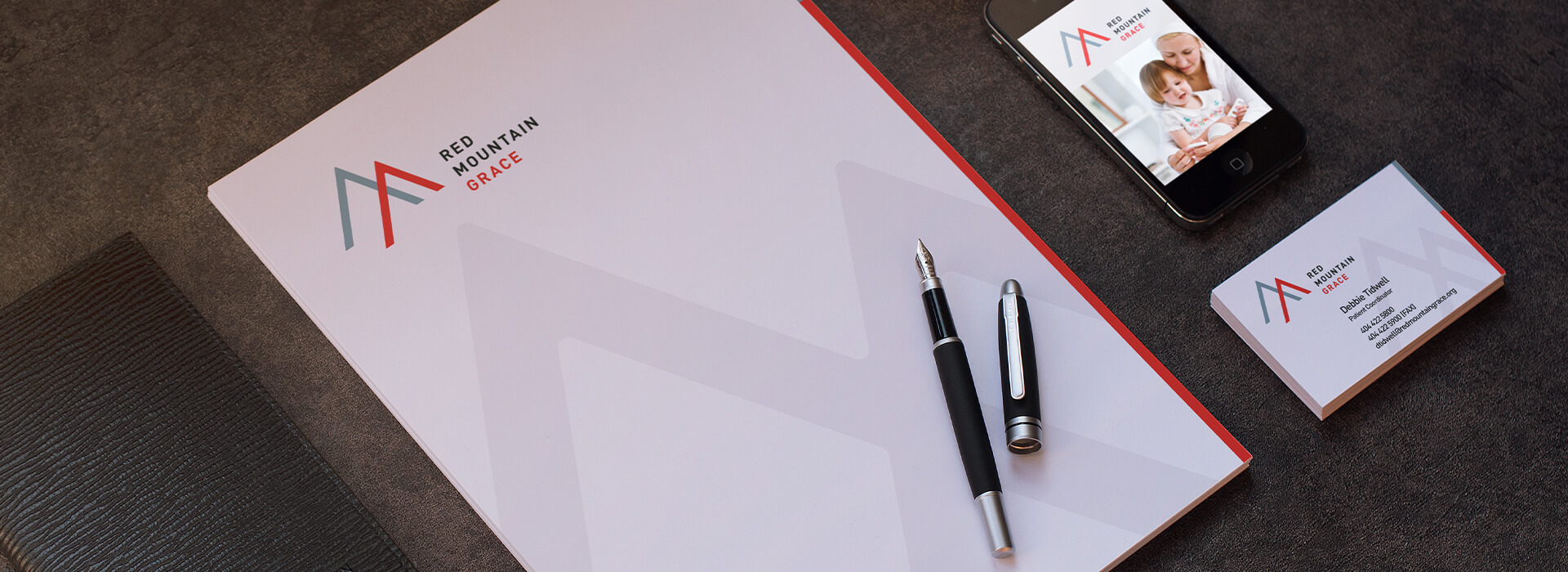
A selected color palette references Red Mountain Grace’s name with the use of red and accompanying grays and creams. They allude to both the geological traits of nearby Red Mountain in their home city of Birmingham and the neutrals of a calming environment.
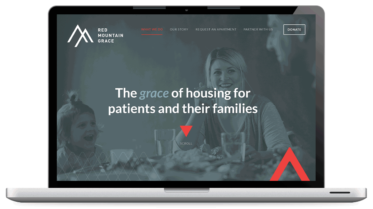
The Website
For the website design, we implemented a highly visual style, using large imagery and clear direction, as well as a unique layout that reflects the angular brand.
The photography standards we developed to be used across the brand pieces including the website have the goal of making a strong emotional connection with the viewer. Personal connection is shown in both domestic environments and hospitals. Images show the giving and experiencing of grace: the respite of a quiet, clean home, a sensitive portrayal of the pain that brings patients to RMG, or connection between family members.