Moody Publishers: Women’s Magazine Rebrand
Summary
A couple of years ago, Moody Publishers Women approached us about a new direction for their biannual magazine. The magazine is well-known throughout their target audience, and challenges the reader to do something more with their relationship with God and community. While the old magazines were closely tied to the original Moody Publishers brand, this new one was to take a different approach and visually separate the MPW brand from the publishing brand so that it could stand on its own and visually reflect the mission of MPW.
DESIGN
Sara Reitenbach
SERVICES
Branding
Layout
Print Design

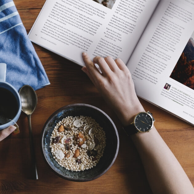
The magazine features articles from many well-known female Christian leaders, bloggers, and authors and is intended to equip and empower women in their careers, communities, churches, homes, and personal lives.
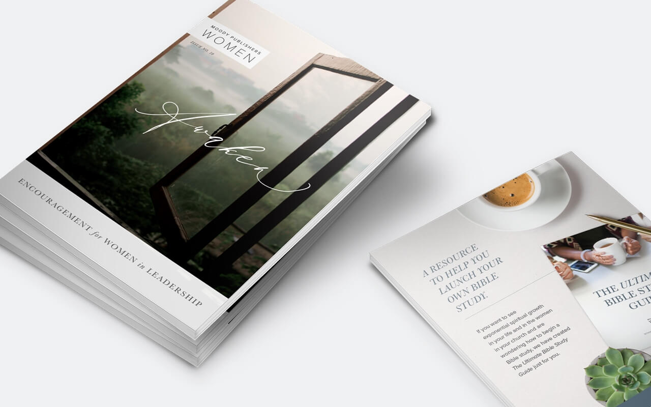
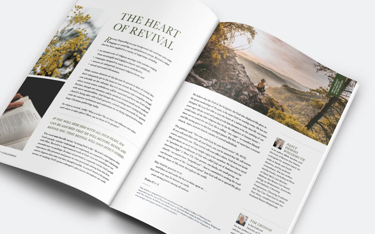
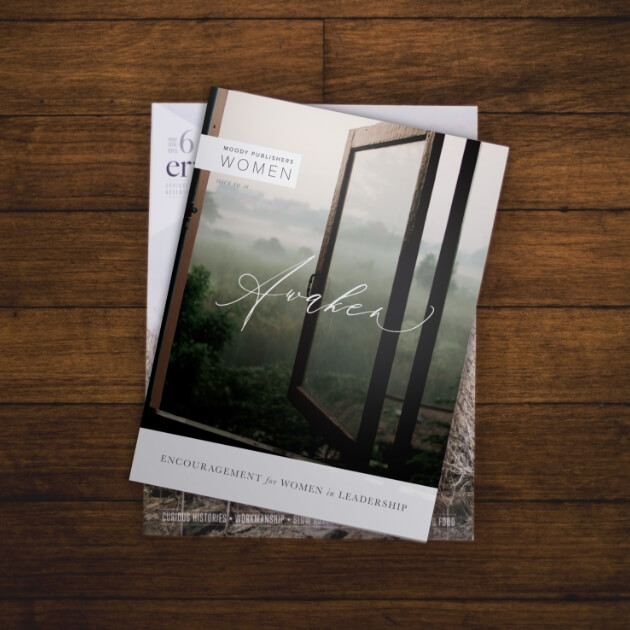
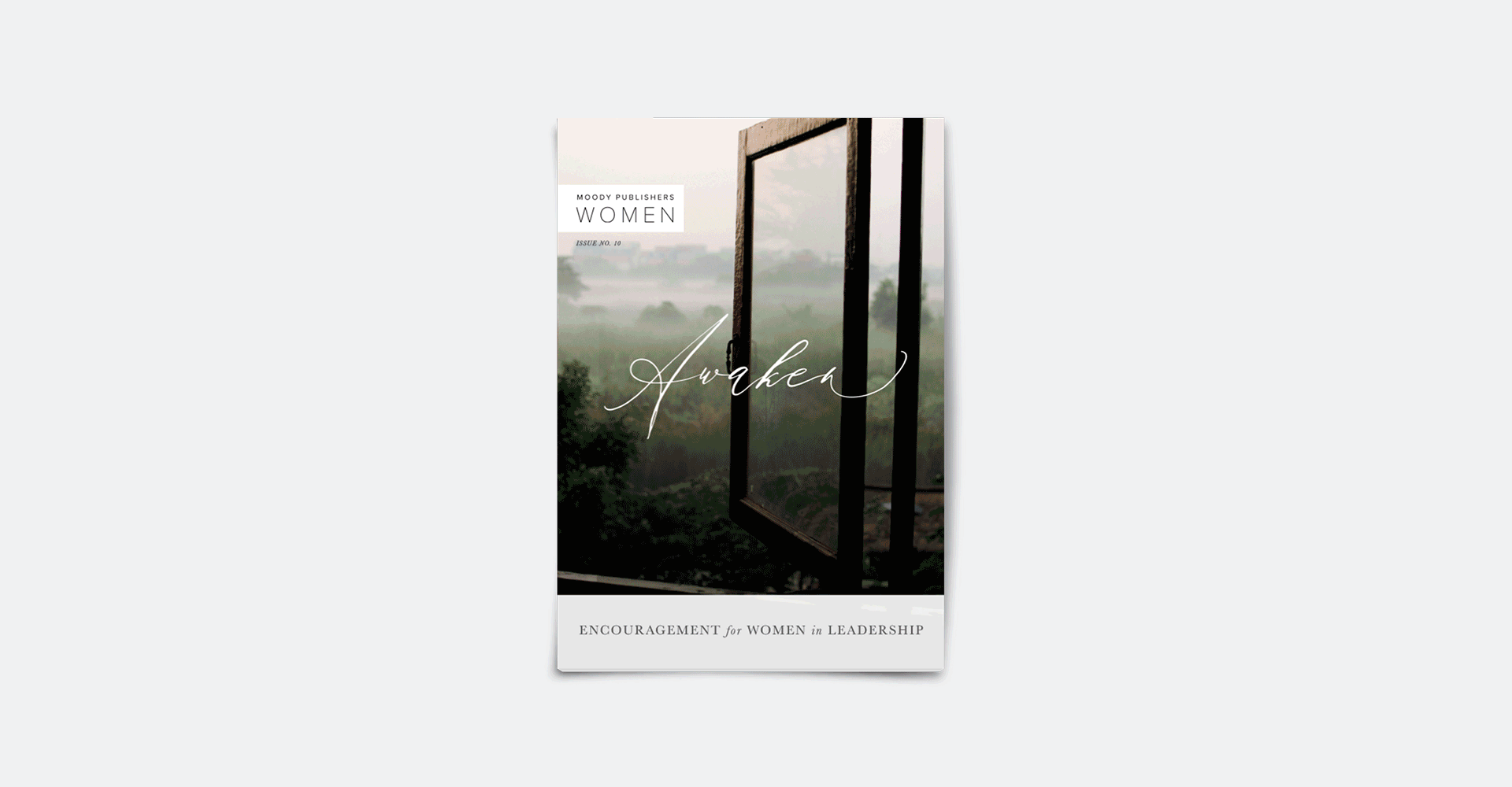
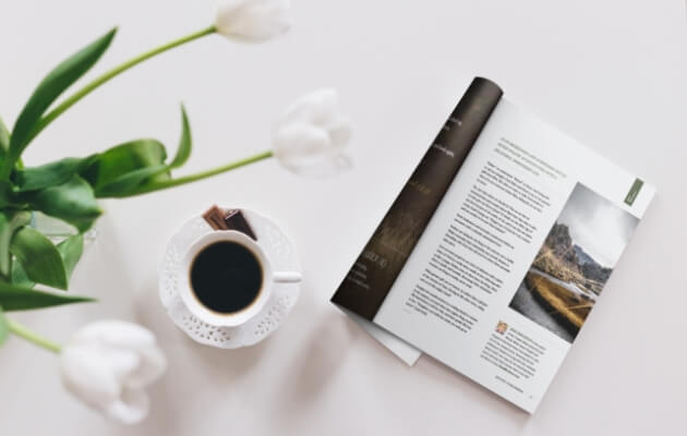
The Moody Publishers Women brand offers a softer, calmer approach to their main brand. Each issue features charcoal and light grays, large images of people, books, nature, botanicals, textures, and strong themes throughout each issue.

The biannual magazine is given a theme each issue. (The issue featured here being “Awaken.") The time of year is reflected in the temperature of the images. This issue was released in the fall so we chose images that were moodier displaying darker hues and cozy scenes.