Grace Church (Chicago): Branding
Summary
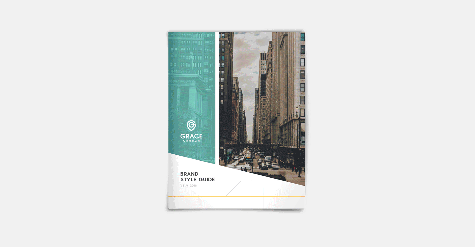
Grace Church wanted Dresden to create a brand for them that focused on the village of Schiller Park, a suburb of Chicago, that they call home. Original concept work for this one included cityscapes, grids, clean lines, and modern san serif fonts. The visual identity we designed for them declares the organization’s embrace of and permanence in the community and its dedication to all the neighbors who live there.
DESIGN
Laura Dreyer
Sara Reitenbach
Josh Feit
SERVICES
Branding
Logo Design
Print Design

Inspired by the elements of cities and maps, the final mark became a marriage of the ‘GC’ of Grace Church and visuals commonly understood to represent a navigation/location marker.

Intersecting lines and sharp angles reflect subway and neighborhood map grids - the industrial feel that Schiller Park represents so well. Soft blue leaves the brand approachable, while yellow and gray tie in some of the colors that mark daily city life most.