Ruby Brick: Branding
Summary
After collaborating together over the years on several different projects, Ruby Brick approached us about assisting them with their own rebrand. This woman-owned digital content agency was looking for a strong, simple, bold brand that modernized their first impression. The process provided many unique problems to solve: the desire to bring some femininity to the brand without being too soft and delicate, the possibility of nods to the words "ruby" or "brick" without being too obvious or cliché. Additionally, is a logo mark the best route for a content agency? Would a seal logo or a word mark better fit a team of writers and content creators?
DESIGN
Sara Reitenbach
SERVICES
Branding
Logo design
Print design
Digital design
Through our discovery process with Ruby Brick and some exploration of our own, we landed on a clean, yet meaningful mark - a simple, effective solution to multiple questions and problems that were posed.
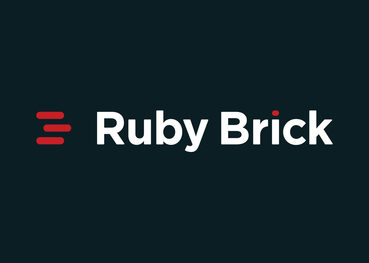
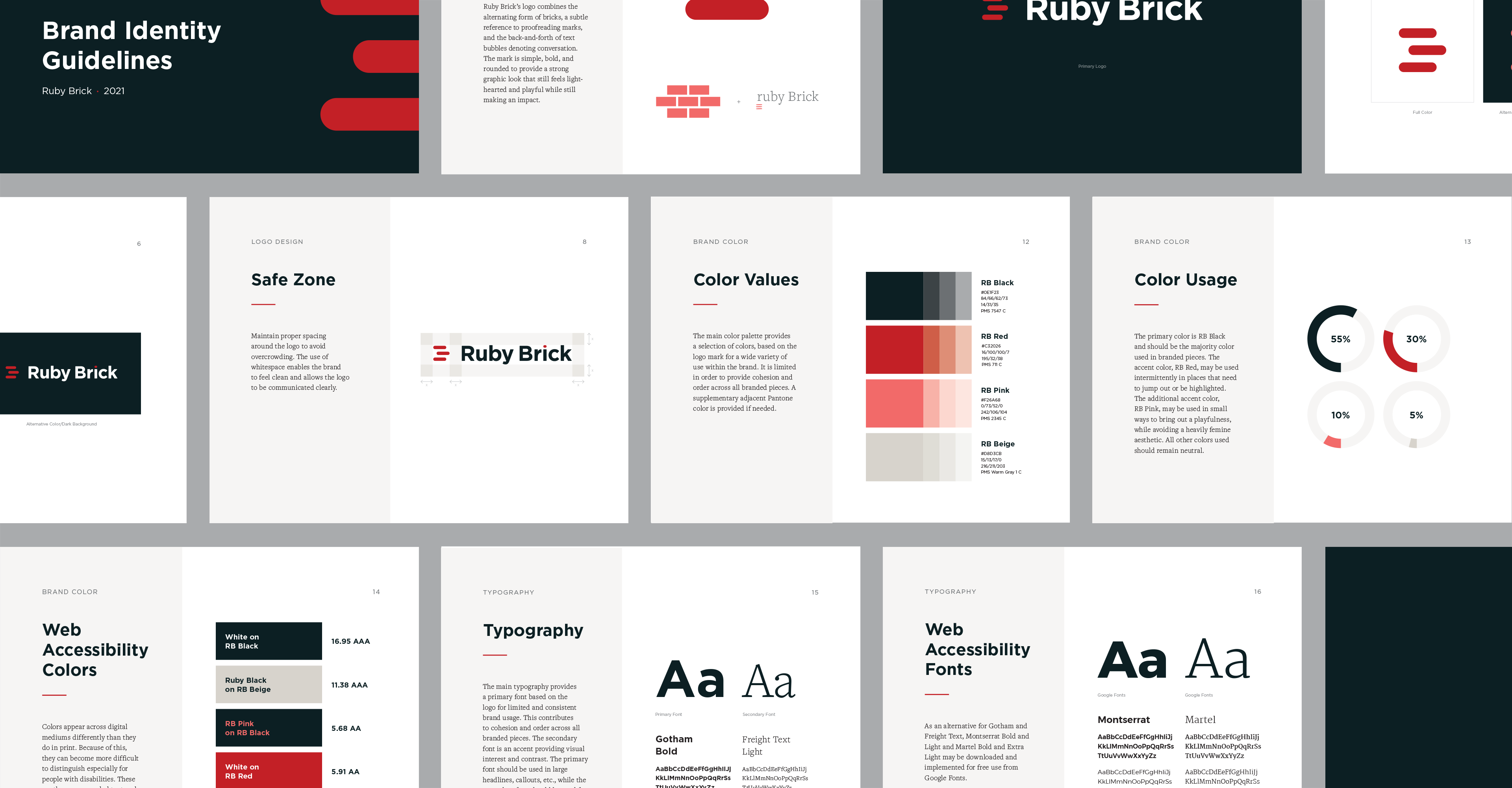
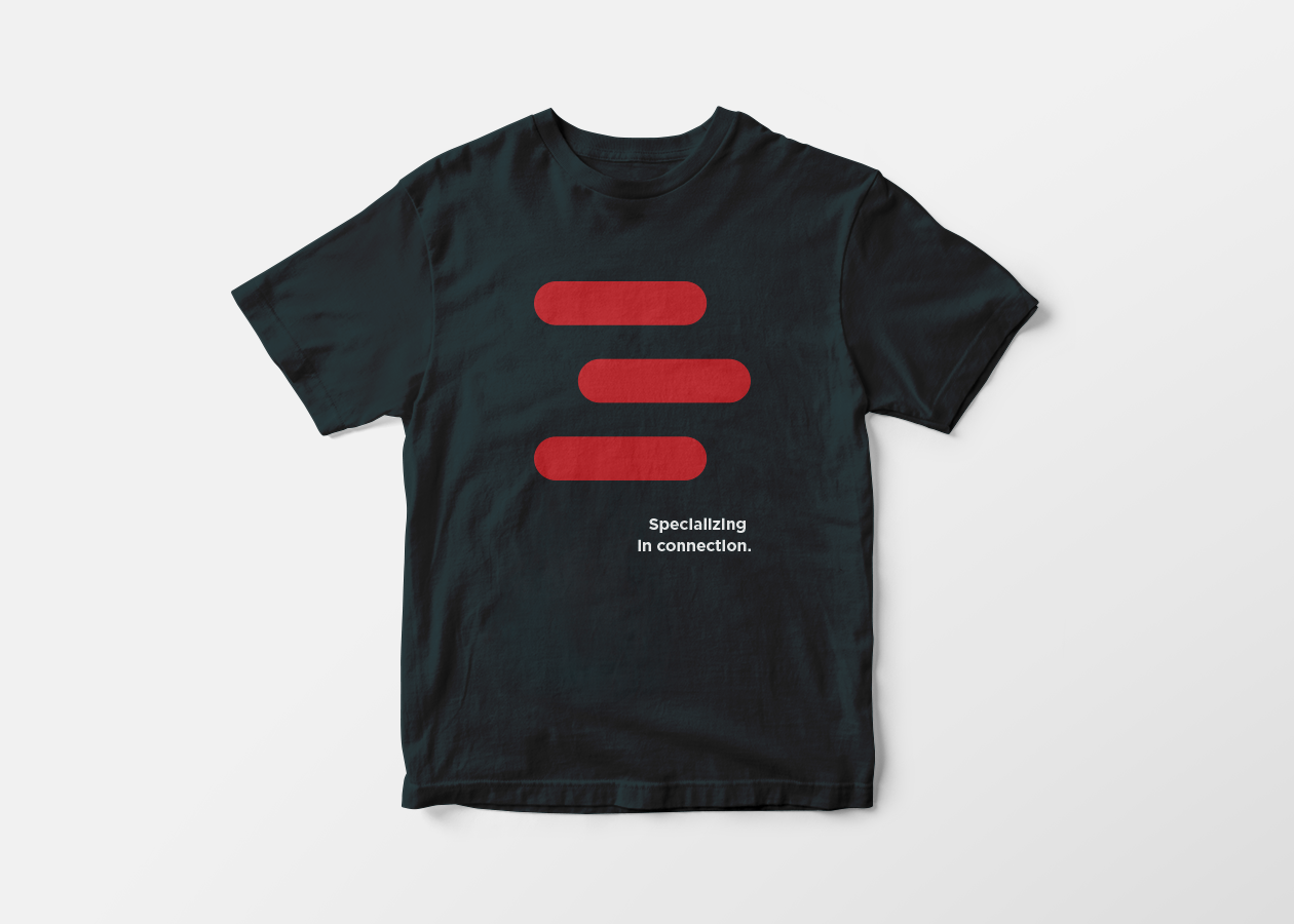
A triple-line copy editor symbol indicating that a letter should be capitalized was pushed beyond it usual limits and used more abstractly. In one moment, the lines could also be a reference to brick laying, while in another, a reference to chat bubbles or lines of text. We then paired the mark with a strong, bold typeface that could hold its own when put up against the thick round lines and bright red color of the mark.

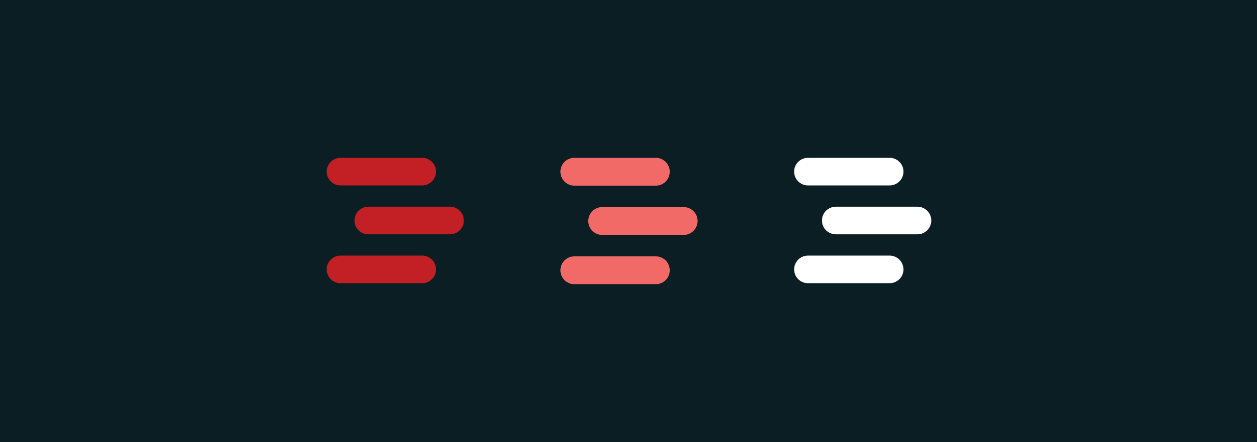
The new color palette we developed for Ruby Brick is bold and striking yet accommodates touches of femininity.
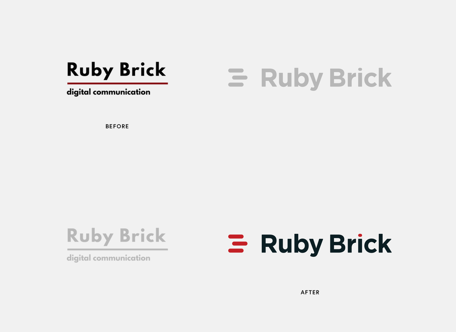
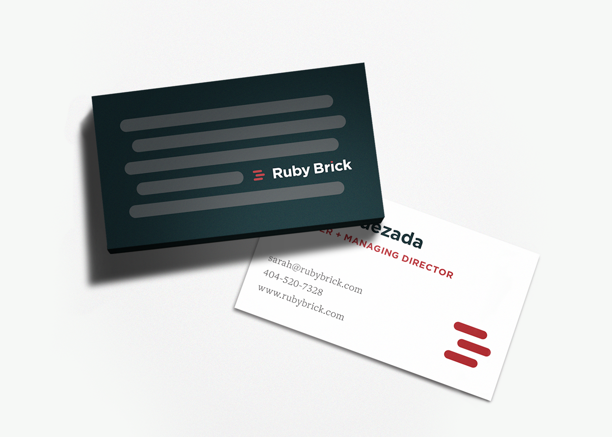
A polished, modern look replaced the old Ruby Brick logo, and set the tone for a strong brand going forward. The Dresden team also produced print and digital assets for them as a part of their brand package including business cards, proposal templates, and social media graphics, to name just a few.
Branding Guidelines
