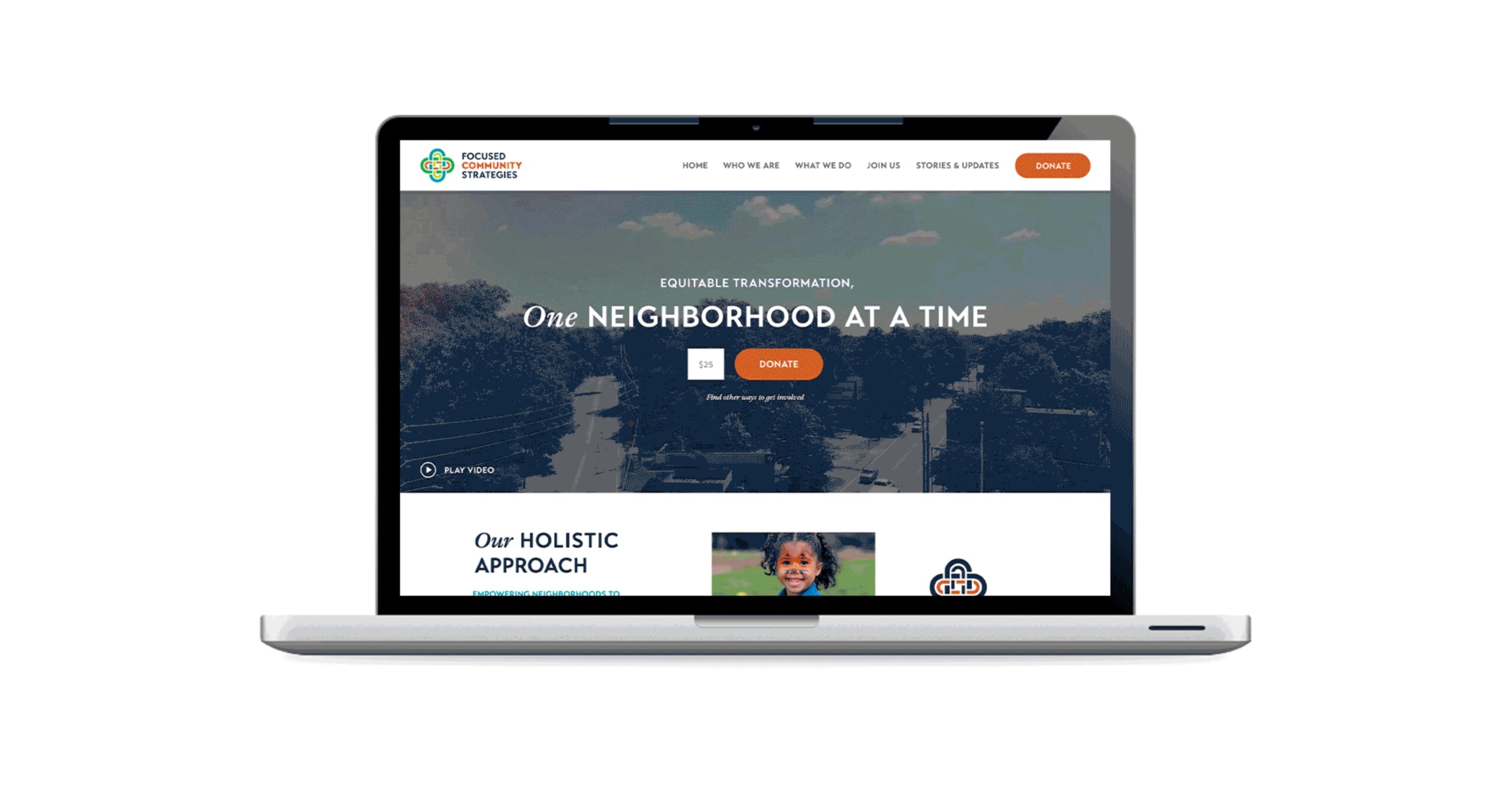
Focused Community Strategies: Brand
Summary
FCS is a long-time client of Dresden’s and is involved in work that our team feels strongly about. That made this project even more important to us. The goal of this rebrand was to mature their brand from youthful to well-established, reflecting their decades of respected work in the South Atlanta area. Additionally, we needed to accomplish this without losing some of their core brand elements. There were three primary solutions our team settled on to accomplish this goal in the final concepts.
DESIGN
Sara Reitenbach
SERVICES
Logo Design
Branding
Full Color Mark
The first solution that the Dresden team implemented was smoothing out the textured edges of the previous logo mark for a cleaner and more modern form.
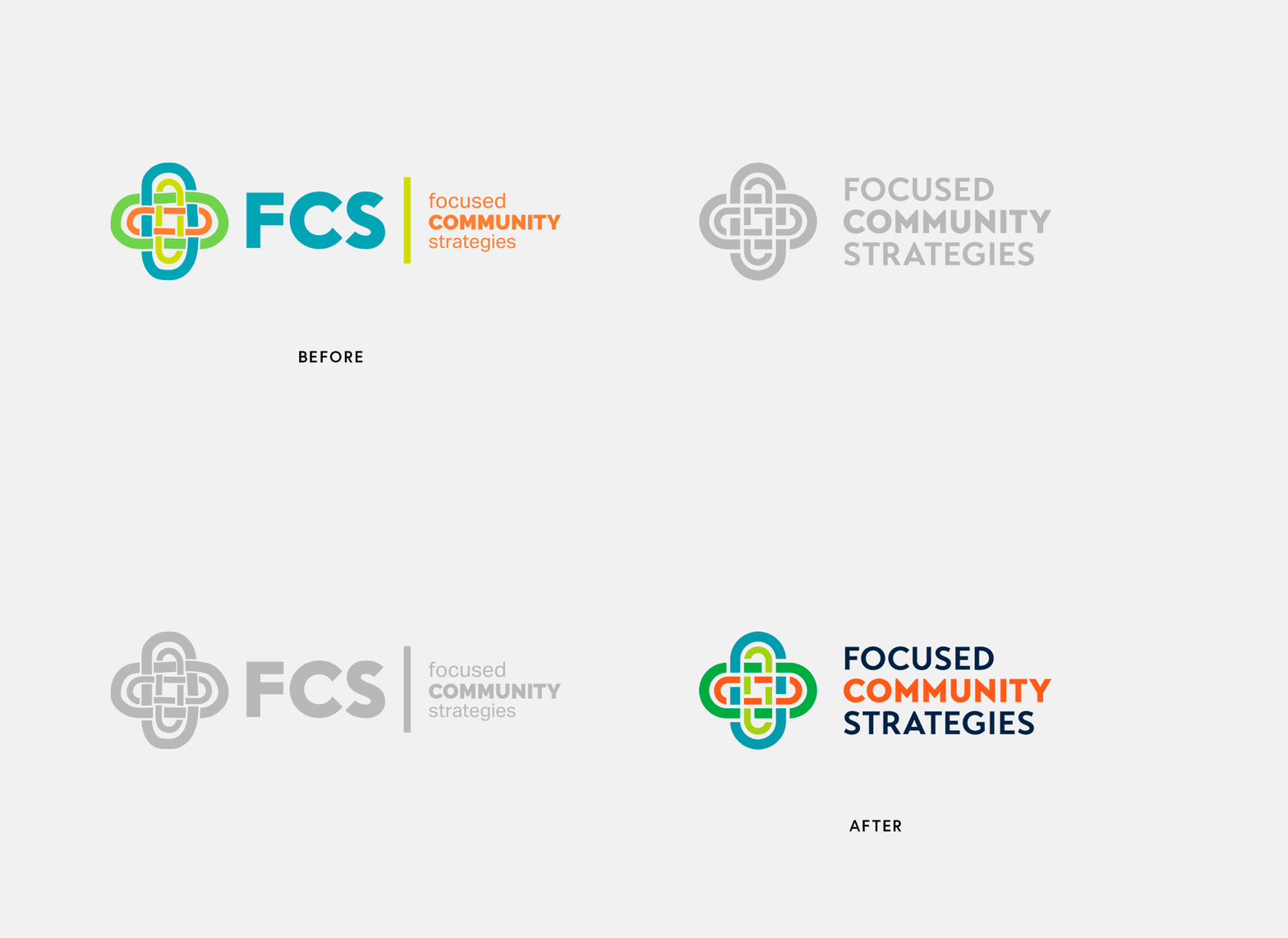
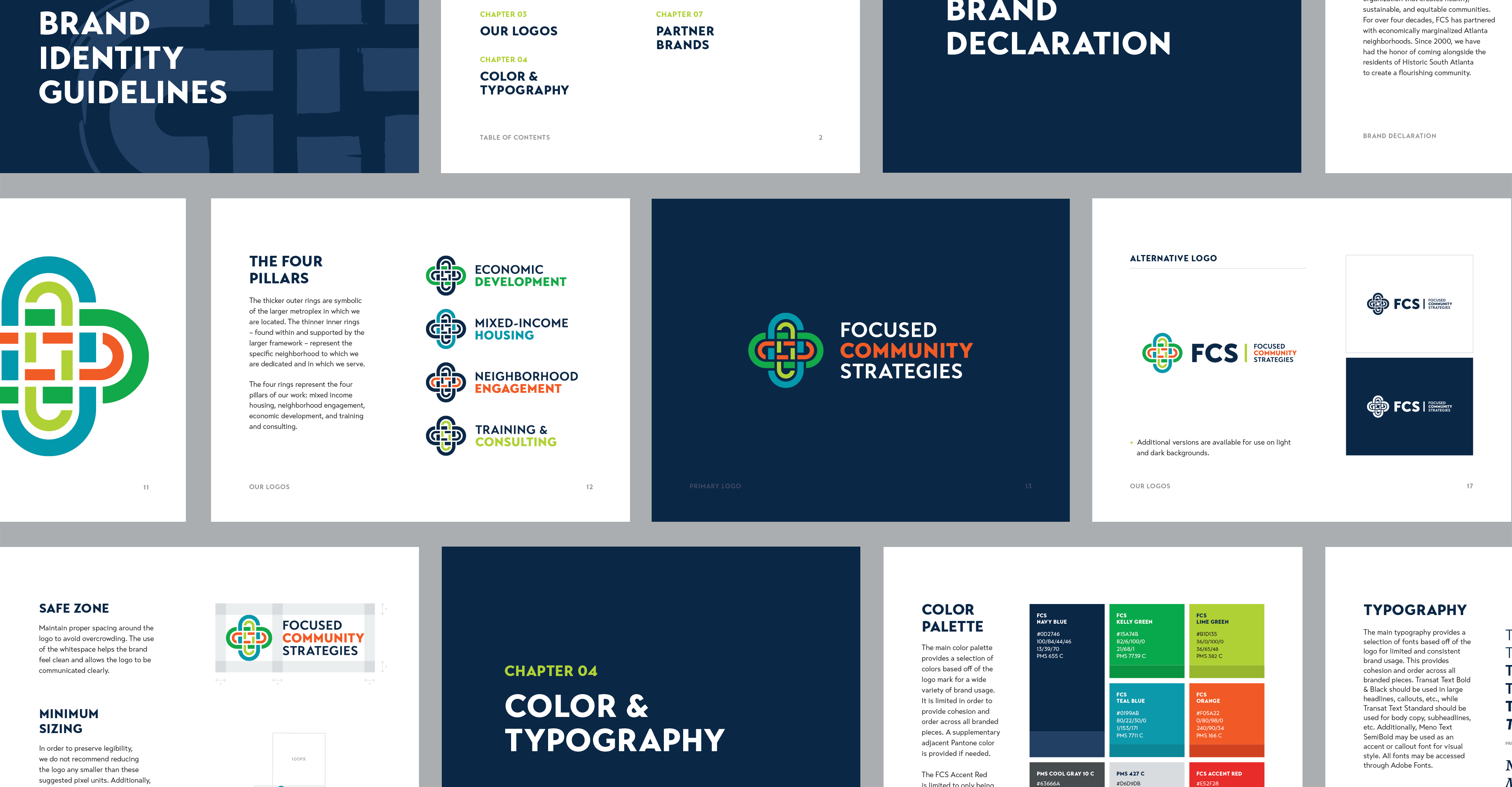
Our team then deepened the original FCS color palette to mature the brand while preserving its colorful nature.


This small change in colors also makes the FCS brand more accessible for online viewers with disabilities and increases their SEO value across their digital presence.

Finally, the team at Dresden replaced the fonts to match the more mature logo mark.
Branding Guidelines
Website
